# EXAMPLE CODE FOR DRAWING A BARPLOT IN R
# 2 February 2008
# ~~~~~~~~~~~~~~~~~~~~~~~~~~~~~~~~~~~~~~~~~~~~~

rm(list = ls())      # Clear all variables
graphics.off()       # Close graphics windows


# GENERATE THE DATA

Age = c(50, 55, 60, 65, 70)                                     # Age groups
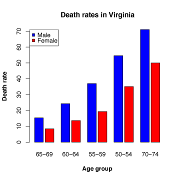
Male = c(15.4, 24.3, 37.0, 54.6, 71.1)                          # Death rates for males
Female = c(8.4, 13.6, 19.3, 35.1, 50.0)                         # Death rates for females
Deathrate = matrix(c(Male,Female), nrow=length(Age)), ncol=2, dimnames=list(Age, c("Male","Female")))
# Create a matrix Deathrate with the data
Deathrate2 = t(Deathrate)                                       # Transpose the Deathrate matrix

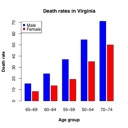
# SIMPLE BARPLOT

windows()                                       # Open a new window for the plot

barplot(Deathrate2,                             # Data (bar heights) to plot
        beside=TRUE,                            # Plot the bars beside one another; default is to plot stacked bars
        space=c(0.2,0.8),                       # Amount of space between i) bars within a group, ii) bars between groups
        names.arg=c("65-69", "60-64", "55-59", "50-54", "70-74"),    #Names for the bars
        col=c("blue", "red"),                   # Color of the bars
        border="black",                         # Color of the bar borders
        main=c("Death rates in Virginia"),      # Main title for the plot
        xlab="Age group",                       # X-axis label
        ylab="Death rate",                      # Y-axis label
        font.lab=2)                             # Font to use for the axis labels: 1=plain text, 2=bold, 3=italic, 4=bold italic

legend("topleft",                               # Add a legend to the plot
        legend=c("Male", "Female"),             # Text for the legend
        fill=c("blue", "red"))                  # Fill for boxes of the legend


# For more information see R help on:
# barplot
# legend


# BARPLOT WITH CONFIDENCE INTERVALS

# Note: To run this graph you need to install the "gplots" and "gtools" packages as follows:
# 1. Connect to the internet
# 2. In the R Console, under "Packages", select "Install Packages"
# 3. Select an R mirror site closest to your location
# 4. Select the "gplots" package
# 5. Redo steps 2 & 4 to install the "gtools" package

library(gplots)   # Load the gplots graphics library
windows()         # Open a new window for the plot

# Generate (fake) confidence intervals (CI should be derived from the underlying data)
cil <- Deathrate2 * 0.85
ciu <- Deathrate2 * 1.15

barplot2(Deathrate2,                            # Data (bar heights) to plot
        beside=TRUE,                            # Plot the bars beside one another; default is to plot stacked bars
        space=c(0.2,0.8),                       # Amount of space between i) bars within a group, ii) bars between groups
        names.arg=c("65-69", "60-64", "55-59", "50-54", "70-74"),    #Names for the bars
        col=c("blue", "red"),                   # Color of the bars
        border="black",                         # Color of the bar borders
        main=c("Death rates in Virginia"),      # Main title for the plot
        xlab="Age group",                       # X-axis label
        ylab="Death rate",                      # Y-axis label
        font.lab=2,                             # Font to use for the axis labels: 1=plain text, 2=bold, 3=italic, 4=bold italic
        plot.ci=TRUE,                           # Plot confidence intervals
        ci.l=cil,                               # Lower values for the confidence interval
        ci.u=ciu,                               # Upper values for the confidence interval
        plot.grid=TRUE)                         # Plot a grid

legend("topleft",                               # Add a legend to the plot
        legend=c("Male", "Female"),             # Text for the legend
        fill=c("blue", "red"),                  # Fill for boxes of the legend
        bg="white")                             # Background for legend box

# For more information see R help on:
# barplot2  (need to install gplots library first)
# legend


# Tufte tips
# - Do not use 3D effects! They are hard to read.

Graphics
A project from the Center for Limnology - UW Madison
This site should be viewed with Firefox
 or Safari


